Gallery Wall — Layouts, Spacing, and Visual Rhythm
A strong gallery wall feels connected before you ever notice why. The spacing is consistent, the layout has a clear rhythm, and one piece quietly anchors the whole arrangement. Whether you prefer a clean grid, a calm row, a panoramic triptych, or a more collected salon-style mix, the goal is the same: make the wall feel intentional.
This guide will help you choose a layout, set the right gap, place the wall at a comfortable height, and combine ratios and surfaces in a way that feels balanced in the room. It is designed to help you move from idea to wall plan with confidence.
Use it alongside the Print Size & PPI Advisor, the Print Materials Hub, Hang, Light & Care, Aspect Ratios, and the Collectors page to plan the wall as a complete composition.
On This Page
This guide walks through the main gallery wall layouts, how to set consistent gaps and hanging height, how to mix ratios and surfaces without visual clutter, and how to solve the most common problems before you start drilling.
Layouts at a Glance — Grid, Row, Triptych, and Salon
Before you choose sizes or materials, choose a structure. A clear layout gives the wall direction and makes every other decision — spacing, height, and framing — much easier.
Once you pick a layout, keep two things consistent: one gap size and one visual midline. That alone will make the wall feel intentional.
Grid Layout
Clean and symmetrical. Best with identical sizes and ratios (often 1:1). Works well in smaller spaces or when you want a calm, structured feel.
Linear Row
Simple and rhythmic. Ideal for hallways or above furniture. Keep one ratio (like 3:2) and align everything along a single horizontal line.
Triptych
A strong focal point. Best for wide scenes split into three panels. Works especially well over sofas and long walls.
Salon Style
More organic and collected. Mix sizes and ratios, but keep spacing consistent and anchor the layout with one central piece.
Helpful next step: Once you choose a layout, move on to spacing and height. Locking those two variables is what makes the wall feel cohesive.
Spacing & Height — The Two Rules That Make Everything Work
If a gallery wall feels off, it’s almost always because spacing or height isn’t consistent. Get these two right, and even mixed layouts will feel clean and intentional.
Choose one gap size and one visual centerline — then apply them across the entire wall.
| Layout Type |
Recommended Gap |
Why It Works |
| Grid |
2–3 in (5–7.5 cm) |
Maintains symmetry and structure |
| Linear Row |
2–3 in (5–7.5 cm) |
Creates rhythm across the wall |
| Triptych |
2–3 in (5–7.5 cm) |
Keeps panels visually connected |
| Salon Style |
One consistent gap |
Unifies mixed sizes and ratios |
Standard Hanging Height
- Center of the layout at 57–60 inches (145–152 cm)
- Works for most standing viewing environments
- Use the center of the full arrangement, not individual frames
Above Furniture
- Leave 6–10 inches (15–25 cm) between furniture and artwork
- Then adjust the layout’s center visually (don’t force the 57" rule)
- Prevents the wall from feeling cramped or disconnected
Alignment Tips
- Use one consistent midline across the entire layout
- Align either centers or tops — don’t mix randomly
- Painter’s tape or paper templates help before drilling
Quick planning tip: Total wall width = (sum of artwork widths) + (gap × number of spaces). Plan the full layout first, then place the anchor piece and build outward.
Mixing Ratios & Surfaces — Keep It Cohesive
A gallery wall doesn’t need to be uniform to feel intentional. You can mix sizes, ratios, and materials — as long as a few key elements stay consistent.
Think of it this way: variety creates interest, but repetition creates cohesion.
Mixing Aspect Ratios
- Use one anchor piece (largest or most visually dominant)
- Keep the same ratio within rows or grids
- Mix ratios more freely in salon-style layouts
- Pair wide formats (2:1) with balanced formats (3:2) for contrast
Mixing Print Surfaces
- Metal (satin): clean, modern, low-glare anchor pieces
- Canvas: soft, matte texture for warmth
- Acrylic: use sparingly as a focal highlight
- Framed paper: ties everything together with consistency
Frame & Finish Consistency
- Limit to one or two frame finishes (e.g., black + wood)
- Use consistent mat colors if framing multiple pieces
- Keep frame thickness within a similar range
Color & Visual Flow
- Repeat 1–2 key colors across multiple images
- Balance dark and light pieces across the wall
- Avoid clustering all bold pieces in one area
Simple rule: You can mix almost anything — as long as spacing stays consistent, the layout has a clear center, and one element repeats across the wall.
Room Examples — Try It in Real Spaces
Gallery walls work best when they respond to the room they live in. The wall above a sofa wants something different than a hallway, an entry, or a media wall.
Use these as starting templates, then test spacing and scale with Wall Preview or Live Preview AR before you hang.
Living Room — Panoramic Anchor or Triptych
Best for wide furniture walls where height is limited.
- Use a wide anchor piece or split panorama
- Span about 60–75% of the sofa width
- Leave 6–10 inches above the furniture
Entryway — Vertical Pair or Tight Grid
Best for narrower walls where clean structure matters.
- Use 4:5 verticals or a 2×2 square grid
- Keep side clearances even
- Use one consistent gap across the layout
Hallway — Linear Row
Best for long sightlines and a quieter visual rhythm.
- Repeat the same ratio and size for calm continuity
- Align all centers on one horizontal midline
- Keep spacing tight and regular
Bedroom — Softer Cluster
Best for warmer, quieter presentation with less glare.
- Use a smaller grouped layout rather than an oversized wall
- Canvas and framed prints tend to feel softer here
- Hang slightly lower for seated viewing comfort
Media Wall — Clean and Controlled
Best when you want artwork to live well alongside a television or digital display.
- Use wider formats near screens
- Favor low-glare materials like satin metal or framed paper
- Keep the composition simple so the wall doesn’t feel busy
Helpful next step: Mock up the arrangement with painter’s tape, then confirm size and spacing using Wall Preview, Live Preview AR, and the Print Size & PPI Advisor.
Troubleshooting — Fix the Common Problems Fast
Most gallery wall issues come down to spacing, alignment, or balance. The fixes are usually simple once you know what to adjust.
Uneven Spacing
- Pick one gap (usually 2–3 inches) and use it everywhere
- Use a spacer or template instead of eyeballing
- Measure from frame edge to frame edge, not image to image
Crooked or Tilting Frames
- Use two hooks instead of one
- Add small wall bumpers to stabilize the bottom corners
- Check wire tension — too loose causes tilt
The Wall Feels Unbalanced
- Start with one clear anchor piece
- Distribute larger or darker images evenly
- Avoid clustering all visual weight in one area
Hanging Too High or Too Low
- Keep the layout centered around 57–60 inches
- Above furniture: prioritize the 6–10 inch gap
- Adjust visually — don’t follow rules blindly
Glare or Reflections
- Angle lighting to about 30°
- Reduce brightness to avoid hotspots
- Use low-glare materials like satin metal or framed prints
Key takeaway: Fix spacing first, then alignment, then balance. Most walls come together quickly once those three are dialed in.
Naturepedia Connections
A gallery wall is ultimately about relationships — between images, spaces, light, rhythm, and balance. The way multiple photographs work together on a wall echoes the same underlying patterns that shape how scenes are experienced in the field.
- Photons — Every gallery wall begins with light, and light changes how each piece reads in relation to the others.
- Resonance — Repetition, rhythm, and spacing determine whether a wall feels calm, cohesive, or visually noisy.
- Vibration — Small shifts in proportion, gap, and placement can change the energy of the full arrangement.
- Quantum Fields — A deeper layer behind structure, relation, and how separate parts become a unified visual experience.
Explore the broader system in Naturepedia.
About the Photographer
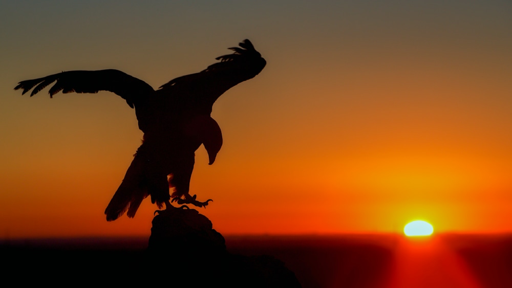
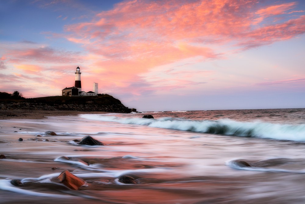
I’m Robbie George, a field-based wildlife and nature photographer. My work is shaped by time spent in places like Yellowstone, Bosque del Apache, and along the Atlantic coast — learning how light, composition, timing, and atmosphere come together in real environments.
A gallery wall is more than a collection of prints. It’s a way of letting multiple field moments speak to each other in one space. The best walls hold rhythm, variation, and balance — so the room feels connected rather than crowded.
Explore more of my work and field approach:
Nature Photographer · Fine Art Nature Photographer · Nature Pictures Gallery